Saturday, March 3, 2012

USA Postage Stamps:
New York
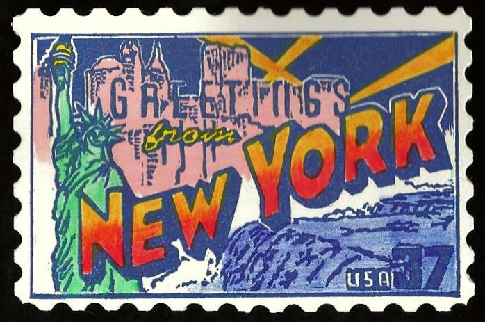
This was the second card i did for the US Postage Stamps swap.  I was just trying to help fill the entire set and this was one of the last states left.  This was a bit harder for me than the South Carolina one because of the Statue of Liberty and the buildings with words intertwined with them.  I was just trying to keep everything lined up correctly with the carve because it was a one color stamp (navy blue) and some of the letters in "Greetings" were not defined as well as i would have liked them to be.  The rest of the colors i used were a combination of colored pencils, markers, and watercolor.  Again i wished i had carved it bigger than what it turned out to be.  This would have been better had it been slightly larger so i could do some of the more intricate facial features and details on the statue.  But i liked some of the lettering and the fact that it helped fill the tracker to achieve a full set.
USA Postage Stamps: South Carolina
This card was for the US Postage Stamps tracker which was a series commemorating all the states with a unique image related to each state.  The reason i chose SC was that we were traveling there late in the year and i thought it would be cool to do this up as a card and then plant it later in the state as a traditional.  This was a bit of a challenge in getting the colors right and some of the intricate details in the buildings and script letters.  I was pleased with how this turned out but probably should have measured it a little bigger because i knew i was using scalloped edges for the borders so i made the stamp smaller than it needed to be.  But i still thought it turned out fairly well even with some of the small flaws here and there.

Thursday, March 1, 2012

Wizard of Oz: Treasured Trio

This was for another Wizard of Oz tracker i signed up for.  I had been wanting to do something with the main characters for a while as well as doing another stamp to go with my previous cards.  It wasn't easy finding the right image but luckily after digging around for a while i found this one.  I really liked that the three main characters were all together and doing more of a publicity shot.  I liked some of the details on the scarecrow as well as his hand behind the tin man.  I wasn't as happy with some of the lion's fur and the tin man's face and body but it was a large stamp and the card folded out.  So i was trying something new with a foldout card.  And i also wanted to keep it black and white with a tinge of grey so i opted for a very light grey card stock.  I think the piece has that old quality to it.
Here is the front of the card i did.  I just wanted to do something of a title card like the beginning of the movie would have.  I really liked how the letters turned out.  The card folded in half and then opened horizontally to display the main characters from above.