Famous Authors: Arthur Conan Doyle
This card was for the LTC tracker Famous Authors. I ended chose Doyle because i was in the midst of doing a Sherlock Holmes tracker as well as having seen the tv series and movies recently. He just stood out as someone who would be cool to do. I originally did not carve his name on the stamp but thought it might be better if i had it on the card so proceeded to carve his moniker on a separate stamp. It took me quite a few tries on some scraps to get that lettering right and i still had it just a 1/16 or so longer than the card stock so that also made it more difficult to line up correctly. I stamped them both of a glossy card stock which really made the black pop. You cannot press hard on glossy card stock or else the images will smear. So you just have make sure you have enough inked applied and just give a firm but delicate impression when stamping. The lines on his face and jacket could have been tighter and less jagged but i think the area around his moustache, lips and mouth came out very well.
Monday, September 3, 2012
Movies from A to Z: Quantum of Solace
This was a last second addition to my Movies from A to Z tracker. someone had not turned their card in so i had to come up with a movie, design, and card within a few days so i could get them all out by the time the Academy Awards premiered. This actually turned out better than i thought. The lettering, which can be hit or miss sometimes, turned out a little choppy. They could have been a little neater and less wobbly. For the most part, i think Daniel Craig's face turned out fairly well. It could have been a little cleaner and more defined but overall it was a cool card and welcome addition to the set. I ended up using grey markers on his face, red marker to fill in the OO7 and used black pastel chalk to do the shading next to him.
Movies From A to Z: Zodiac
This tracker was my first tracker that i ever hosted. I really wanted to do something movie themed and to coincide with the Academy Awards. I basically sent out requests to all my favorite carvers and had them fill up the tracker. I was going to take whatever letter was left after everyone chose theirs. I had a feeling i would be doing one of the less popular letters so i already had in mind what movies i would be doing for certain letters. I chose "Zodiac" because of my love for all of David Fincher's films as well as it was one of the few movies that began with "Z" that i liked. I wanted to do a card with a movie poster look to it. I had this idea to do a double embossing where the title of the film would be black and the Zodiac symbol would be red. This took a little bit longer and was more challenging than i thought. But in the end it worked out and it looked cool. I liked how the black embossing almost disappears with the black card stock. I then had three different images i collected to carve and assemble. The two main characters and the golden gate bridge were all separate images i found and then pieced together to carve. I thought it turned out pretty well. I think Robert Downey Jr's face could have been photoshopped better and his hair got cut off a little but it's a nice card. I added some fog with a pencil for some of the background and used a grey card stock for my foreground stamps and then pasted the whole thing onto black.
Saturday, March 3, 2012
USA Postage Stamps:
New York
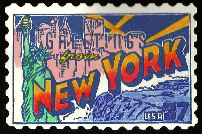
This was the second card i did for the US Postage Stamps swap. I was just trying to help fill the entire set and this was one of the last states left. This was a bit harder for me than the South Carolina one because of the Statue of Liberty and the buildings with words intertwined with them. I was just trying to keep everything lined up correctly with the carve because it was a one color stamp (navy blue) and some of the letters in "Greetings" were not defined as well as i would have liked them to be. The rest of the colors i used were a combination of colored pencils, markers, and watercolor. Again i wished i had carved it bigger than what it turned out to be. This would have been better had it been slightly larger so i could do some of the more intricate facial features and details on the statue. But i liked some of the lettering and the fact that it helped fill the tracker to achieve a full set.
New York
This was the second card i did for the US Postage Stamps swap. I was just trying to help fill the entire set and this was one of the last states left. This was a bit harder for me than the South Carolina one because of the Statue of Liberty and the buildings with words intertwined with them. I was just trying to keep everything lined up correctly with the carve because it was a one color stamp (navy blue) and some of the letters in "Greetings" were not defined as well as i would have liked them to be. The rest of the colors i used were a combination of colored pencils, markers, and watercolor. Again i wished i had carved it bigger than what it turned out to be. This would have been better had it been slightly larger so i could do some of the more intricate facial features and details on the statue. But i liked some of the lettering and the fact that it helped fill the tracker to achieve a full set.
USA Postage Stamps: South Carolina
This card was for the US Postage Stamps tracker which was a series commemorating all the states with a unique image related to each state. The reason i chose SC was that we were traveling there late in the year and i thought it would be cool to do this up as a card and then plant it later in the state as a traditional. This was a bit of a challenge in getting the colors right and some of the intricate details in the buildings and script letters. I was pleased with how this turned out but probably should have measured it a little bigger because i knew i was using scalloped edges for the borders so i made the stamp smaller than it needed to be. But i still thought it turned out fairly well even with some of the small flaws here and there.
Thursday, March 1, 2012
Wizard of Oz: Treasured Trio
This was for another Wizard of Oz tracker i signed up for. I had been wanting to do something with the main characters for a while as well as doing another stamp to go with my previous cards. It wasn't easy finding the right image but luckily after digging around for a while i found this one. I really liked that the three main characters were all together and doing more of a publicity shot. I liked some of the details on the scarecrow as well as his hand behind the tin man. I wasn't as happy with some of the lion's fur and the tin man's face and body but it was a large stamp and the card folded out. So i was trying something new with a foldout card. And i also wanted to keep it black and white with a tinge of grey so i opted for a very light grey card stock. I think the piece has that old quality to it.
Here is the front of the card i did. I just wanted to do something of a title card like the beginning of the movie would have. I really liked how the letters turned out. The card folded in half and then opened horizontally to display the main characters from above.
Monday, November 14, 2011
Locke Zombie
This was for the OMG Zombies and Monsters tracker. I love anything related to zombies so this was a given to do something in this genre. I had really loved a comic book as a kid called Deadworld which had the whole people vs zombies storyline but with some new twists added as well. But the one thing that stood out about these comics were the covers. An artist by the name of Vincent Locke who does a lot of graphic drawings and paintings of zombies and monsters did most of the covers for the series. And i was always a huge fan of this piece he had done for the first issue so i wanted to see if i could duplicate the image with my own take and style. I was very happy with how this one turned out and really like the moldy kaleidoscope of colors i added for effect.
American Pickers: B & M Railroad Lantern
This was for the American Picker tracker.
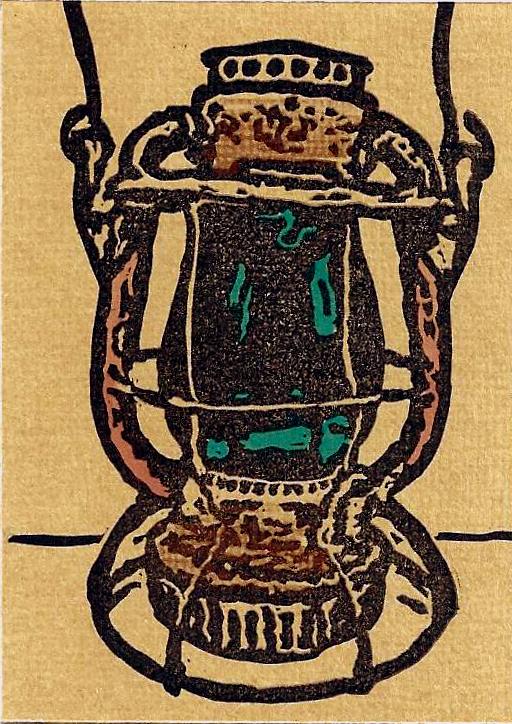
The television show, which showcases hidden treasures found within backyards and barns, is a favorite of mine. I love antiques and historical items and so it was just natural pick for me to do this series. I had so many ideas and it was hard for me to narrow down my choice. I ended up just gravitating to these old lanterns that were used during the heyday of railroads. This was not an item that is usually featured on the show but i just liked the history behind it. I tried to make the glass case stand out a little with the color and have some copper color accent the handles. In the end it could have been smaller carve and could have been designed a bit better but it was a decent card.
This was for the American Picker tracker.
The television show, which showcases hidden treasures found within backyards and barns, is a favorite of mine. I love antiques and historical items and so it was just natural pick for me to do this series. I had so many ideas and it was hard for me to narrow down my choice. I ended up just gravitating to these old lanterns that were used during the heyday of railroads. This was not an item that is usually featured on the show but i just liked the history behind it. I tried to make the glass case stand out a little with the color and have some copper color accent the handles. In the end it could have been smaller carve and could have been designed a bit better but it was a decent card.
Wednesday, July 27, 2011
HP 7: part 2
"The Flaw In The Plan"
This card was for the Harry Potter Deathly Hallows tracker. Obviously there were many images and ways to approach this card. I really wanted to incorporate something to do with the last film and what better way than Harry and Voldemort's dueling encounter. This was one of the images that some of the promotional posters had. For the most part i was happy with the faces and how closely they resembled the characters. I think more so with Harry because it was a side view. But i liked the stuff around his eyes and glasses. I tried a couple different pencil/lighting techniques to get the right pop. I tried white, red, green and it seemed green had the most impact.
"The Flaw In The Plan"
This card was for the Harry Potter Deathly Hallows tracker. Obviously there were many images and ways to approach this card. I really wanted to incorporate something to do with the last film and what better way than Harry and Voldemort's dueling encounter. This was one of the images that some of the promotional posters had. For the most part i was happy with the faces and how closely they resembled the characters. I think more so with Harry because it was a side view. But i liked the stuff around his eyes and glasses. I tried a couple different pencil/lighting techniques to get the right pop. I tried white, red, green and it seemed green had the most impact.
Thursday, June 23, 2011
Self Portrait With a Cap by Rembrandt
This LTC was for the tracker Great Works of Art. There literally were dozens of pieces that i was trying to narrow down to but i ended up choosing this one because of its playfulness and line work. I wanted something not too intricate but enough to continue to make progress with fine lines. I thought this stamp came out well. Even though there wasn't any color in the piece, the striking image really helps make it pop. And i enjoyed trying to reproduce a famous piece of artwork on such a smaller scale. Overall, i think it came out as a good representation of a famous work of art.
"Cherry Tree in Blossom" Japan 1981
This was for the Postage Stamp 2 Tracker. There were just so many great images to choose from that it was a hard decision. I went with this one to try my hand at a little more fine line work and because of the subtle colors. I also like Japanese culture and themes so this one just jumped out at me. I was very pleased with how the lines of her face and hand turned out. And i was happy with how the coloring captured the beauty of the piece without overpowering it. I also used a scallop edge puncher to make the postage stamp border around the card.
Thursday, March 31, 2011
Scooby-Doo and the Ghost of Captain Cutler
This one was for a Scooby Doo LTC i did. I ended up choosing two different images and then piecing them together to form a new image. I was very pleased with how this one turned out. I really wanted to incorporate some kind of villian in the card and there were so many great ones to choose from. I just liked the sort of glow in the dark ghostly deep sea diver and the coloring of his outfit so i decided on him. Then i just tried to comb the net to find the right Scooby-Doo to go with him. I was happy with some of the line work around his helmet, hands and seaweed. And with Scooby it was just a matter of cleaning out the negative space inside his frame.
Thursday, January 27, 2011
Movies You've Over-Watched: Jaws
For this tracker there were so many choices i could have picked. I already did my other favorite in an LTC which was the Godfather so i had to take the next one on my list which was Jaws. I probably have seen Jaws the most of any movie ever and could probably recite most of the lines from start to finish. I was very pleased with how this one turned out because i just wasn't sure what image to choose from or if i even could do it justice. But once i got something i liked and fit what i wanted, it wasn't a bad carve. I am very pleased with how well the shark turned out because that was tough to get right. I just didn't know how to handle certain shading and textures but overall this came out well. For the back of the card, i ended up listing a whole bunch of quotes from the film to round it out.
Finding Nemo: Gill
This was for the Finding Nemo tracker i did. This one was a pretty simple carve and design. Not much to it. Probably could have done something with water or a fish tank for the background but decided just to do the character i picked. Just finding a suitable image was tough enough. There just aren't enough reference materials for certain characters out there. I was happy with the area around the eyes and nose. That was a little tricky for me to make them stand out being intricate. I am also happy with the Finding Nemo font. I think the coloring and lettering came out well.
Monday, December 20, 2010
Stephen King: The Dark Half
This tracker was for a Stephen King LTC. There were so many ideas and books that i loved and it was a tough choice. The reason i picked this one was because i thought i could do some interesting things with the birds coming out of his head. I wanted it to look like part of his face and then part of birds manifesting from it. I also like some of the unusual shapes that came out from doing it. I didn't even see or think about them when i did it. I played with different shapes and arrangements until i finally settled on this one. I also liked the stark lime green i used underneath for the lettering. I just shaded in an area where i knew the letters would be and once i stamped over it, i had some color underneath. I enjoyed this tracker and hopefully down the road will get to do some other Stephen King designs.
Chick Flicks:
You've Got Mail
You've Got Mail
This card was for the tracker Chick Flicks. There were so many movies to choose from but i tend to watch this one every time it's on and since i had been doing a lot of likenesses, i figured i would continue that theme and try and do Tom Hanks and Meg Ryan. I also thought of the idea of putting the card in a small envelope with some postal service notifications on the front might be cool. I thought the overall outcome of the stamp was pretty good with the card and envelope together. The back had a bio of the movie with a faux stamp border around it. The only thing that was a little difficult was doing the lettering on the front for this one. Also, stamping it in a different color with the black figures was kind of a pain too. I should have done the letters on another stamp but i tried to do one big stamp.
Friday, December 10, 2010
Yellow Brick Road: The Man Behind The Curtain
This was the second tracker i signed up for The Wizard of Oz. I really wanted to get as many different cards as i could since both trackers were at the same time but i had to come up with two different images. I had just started to get a better handle on faces and so when i found this image of the wizard, i thought i would give it a try. It wasn't a bad carve. A couple spots here and there i might have changed but it was a decent likeness and so i was happy with that. The card was printed on a smooth green card stock. I added stickers to all the backs of the cards representing different scenes from the book series of the Wizard of Oz as well as my signature stamp.
Sunday, December 5, 2010
The Wizard of Oz: Crystal Ball
This carve was a little tough for me. I just couldn't get good images from the film to use as references. It took me a while to try and find a good picture of the base for the witches crystal ball. Then i tried a few different types of papers for the ball itself. I tried embossing on silver shiny paper, but didn't take the ink as well. I tried a slightly light grey card stock which seemed to work well with ink and passed as crystal. I was not as pleased with the eventual carve of Toto but you can still tell it is him and Dorothy didn't come out too bad. My monkey base didn't have the depth i would have liked but in the end it wasn't a bad card. I used a sparkling green sticker paper for the background which is a little tough to see on screen but it does shimmer when tilted and adds a nice touch to the overall design.
Thursday, November 25, 2010
A Kiss From A Rose
This card was for the LTC Bumptious Burlesque. I had narrowed this card down to two images i really liked so i decided to carve both. This first image was of this woman's face with the interesting hat and mysterious quality to her. I was not happy with the way the hair and hat turned out. It looked a little like when you char or burn something and it leaves that crackling effect to it. But i was very happy with the lips, eyes, and overall look to the card which i cut out from a simple egg white card stock. I just found some simple paper with a roses on it and used it as a background. I had some fancy individual letters i bought and used that as the typeface. I also used a die cutter to make the corners a little fancier. For the back i carved a little more risque image which i was happy with but was a simple black and white abstract woman.
AVATAR: Neytiri
This card i enjoyed making but took a little time and effort. Of course with the success of the movie Avatar and the explosion of 3D, i wanted to incorporate that to a card. So i first tried to an embossing of the image and that wasn't bad but i knew i needed something for color and to make it pop. So i thought if i printed it on blue paper i wouldn't have to use blue as the ink. Then i knew i needed something else to make it stand out so i added yellow in the yes and some white sparkles around the face which i added with a fine brush and paint. I then cut out the printed image and glued it to a thicker card stock to raise it up a little more. You can see the shadow effect on the left side of her head to show the depth. I found some scrapbook paper with some natural forest greenery as a background and glued that onto a card. My carving skills with faces has increased ten fold since this piece so even though i am happy with it, i know her face could have been even better and more realistic. But i enjoyed the card and how it all came together.
Here is the back of the card. I was really pleased with the title font that i carved. Lettering can be tricky but i feel this came really close to the actual lettering on all the Avatar press materials. I added my signature stamp and a small bio of the significance of the film and its' history.
Subscribe to:
Posts (Atom)