Locke Zombie
This was for the OMG Zombies and Monsters tracker. I love anything related to zombies so this was a given to do something in this genre. I had really loved a comic book as a kid called Deadworld which had the whole people vs zombies storyline but with some new twists added as well. But the one thing that stood out about these comics were the covers. An artist by the name of Vincent Locke who does a lot of graphic drawings and paintings of zombies and monsters did most of the covers for the series. And i was always a huge fan of this piece he had done for the first issue so i wanted to see if i could duplicate the image with my own take and style. I was very happy with how this one turned out and really like the moldy kaleidoscope of colors i added for effect.
Monday, November 14, 2011
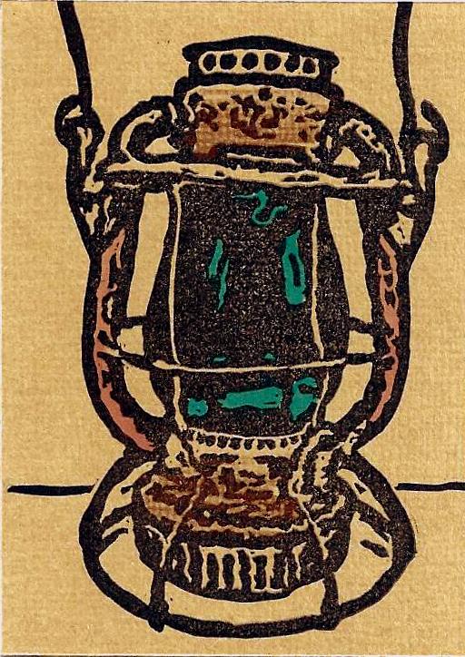
American Pickers: B & M Railroad Lantern
This was for the American Picker tracker.
The television show, which showcases hidden treasures found within backyards and barns, is a favorite of mine. I love antiques and historical items and so it was just natural pick for me to do this series. I had so many ideas and it was hard for me to narrow down my choice. I ended up just gravitating to these old lanterns that were used during the heyday of railroads. This was not an item that is usually featured on the show but i just liked the history behind it. I tried to make the glass case stand out a little with the color and have some copper color accent the handles. In the end it could have been smaller carve and could have been designed a bit better but it was a decent card.
This was for the American Picker tracker.
The television show, which showcases hidden treasures found within backyards and barns, is a favorite of mine. I love antiques and historical items and so it was just natural pick for me to do this series. I had so many ideas and it was hard for me to narrow down my choice. I ended up just gravitating to these old lanterns that were used during the heyday of railroads. This was not an item that is usually featured on the show but i just liked the history behind it. I tried to make the glass case stand out a little with the color and have some copper color accent the handles. In the end it could have been smaller carve and could have been designed a bit better but it was a decent card.
Wednesday, July 27, 2011
HP 7: part 2
"The Flaw In The Plan"
This card was for the Harry Potter Deathly Hallows tracker. Obviously there were many images and ways to approach this card. I really wanted to incorporate something to do with the last film and what better way than Harry and Voldemort's dueling encounter. This was one of the images that some of the promotional posters had. For the most part i was happy with the faces and how closely they resembled the characters. I think more so with Harry because it was a side view. But i liked the stuff around his eyes and glasses. I tried a couple different pencil/lighting techniques to get the right pop. I tried white, red, green and it seemed green had the most impact.
"The Flaw In The Plan"
This card was for the Harry Potter Deathly Hallows tracker. Obviously there were many images and ways to approach this card. I really wanted to incorporate something to do with the last film and what better way than Harry and Voldemort's dueling encounter. This was one of the images that some of the promotional posters had. For the most part i was happy with the faces and how closely they resembled the characters. I think more so with Harry because it was a side view. But i liked the stuff around his eyes and glasses. I tried a couple different pencil/lighting techniques to get the right pop. I tried white, red, green and it seemed green had the most impact.
Thursday, June 23, 2011
Self Portrait With a Cap by Rembrandt
This LTC was for the tracker Great Works of Art. There literally were dozens of pieces that i was trying to narrow down to but i ended up choosing this one because of its playfulness and line work. I wanted something not too intricate but enough to continue to make progress with fine lines. I thought this stamp came out well. Even though there wasn't any color in the piece, the striking image really helps make it pop. And i enjoyed trying to reproduce a famous piece of artwork on such a smaller scale. Overall, i think it came out as a good representation of a famous work of art.
"Cherry Tree in Blossom" Japan 1981
This was for the Postage Stamp 2 Tracker. There were just so many great images to choose from that it was a hard decision. I went with this one to try my hand at a little more fine line work and because of the subtle colors. I also like Japanese culture and themes so this one just jumped out at me. I was very pleased with how the lines of her face and hand turned out. And i was happy with how the coloring captured the beauty of the piece without overpowering it. I also used a scallop edge puncher to make the postage stamp border around the card.
Thursday, March 31, 2011
Scooby-Doo and the Ghost of Captain Cutler
This one was for a Scooby Doo LTC i did. I ended up choosing two different images and then piecing them together to form a new image. I was very pleased with how this one turned out. I really wanted to incorporate some kind of villian in the card and there were so many great ones to choose from. I just liked the sort of glow in the dark ghostly deep sea diver and the coloring of his outfit so i decided on him. Then i just tried to comb the net to find the right Scooby-Doo to go with him. I was happy with some of the line work around his helmet, hands and seaweed. And with Scooby it was just a matter of cleaning out the negative space inside his frame.
Thursday, January 27, 2011
Movies You've Over-Watched: Jaws
For this tracker there were so many choices i could have picked. I already did my other favorite in an LTC which was the Godfather so i had to take the next one on my list which was Jaws. I probably have seen Jaws the most of any movie ever and could probably recite most of the lines from start to finish. I was very pleased with how this one turned out because i just wasn't sure what image to choose from or if i even could do it justice. But once i got something i liked and fit what i wanted, it wasn't a bad carve. I am very pleased with how well the shark turned out because that was tough to get right. I just didn't know how to handle certain shading and textures but overall this came out well. For the back of the card, i ended up listing a whole bunch of quotes from the film to round it out.
Finding Nemo: Gill
This was for the Finding Nemo tracker i did. This one was a pretty simple carve and design. Not much to it. Probably could have done something with water or a fish tank for the background but decided just to do the character i picked. Just finding a suitable image was tough enough. There just aren't enough reference materials for certain characters out there. I was happy with the area around the eyes and nose. That was a little tricky for me to make them stand out being intricate. I am also happy with the Finding Nemo font. I think the coloring and lettering came out well.
Monday, December 20, 2010
Stephen King: The Dark Half
This tracker was for a Stephen King LTC. There were so many ideas and books that i loved and it was a tough choice. The reason i picked this one was because i thought i could do some interesting things with the birds coming out of his head. I wanted it to look like part of his face and then part of birds manifesting from it. I also like some of the unusual shapes that came out from doing it. I didn't even see or think about them when i did it. I played with different shapes and arrangements until i finally settled on this one. I also liked the stark lime green i used underneath for the lettering. I just shaded in an area where i knew the letters would be and once i stamped over it, i had some color underneath. I enjoyed this tracker and hopefully down the road will get to do some other Stephen King designs.
Chick Flicks:
You've Got Mail
You've Got Mail
This card was for the tracker Chick Flicks. There were so many movies to choose from but i tend to watch this one every time it's on and since i had been doing a lot of likenesses, i figured i would continue that theme and try and do Tom Hanks and Meg Ryan. I also thought of the idea of putting the card in a small envelope with some postal service notifications on the front might be cool. I thought the overall outcome of the stamp was pretty good with the card and envelope together. The back had a bio of the movie with a faux stamp border around it. The only thing that was a little difficult was doing the lettering on the front for this one. Also, stamping it in a different color with the black figures was kind of a pain too. I should have done the letters on another stamp but i tried to do one big stamp.
Friday, December 10, 2010
Yellow Brick Road: The Man Behind The Curtain
This was the second tracker i signed up for The Wizard of Oz. I really wanted to get as many different cards as i could since both trackers were at the same time but i had to come up with two different images. I had just started to get a better handle on faces and so when i found this image of the wizard, i thought i would give it a try. It wasn't a bad carve. A couple spots here and there i might have changed but it was a decent likeness and so i was happy with that. The card was printed on a smooth green card stock. I added stickers to all the backs of the cards representing different scenes from the book series of the Wizard of Oz as well as my signature stamp.
Sunday, December 5, 2010
The Wizard of Oz: Crystal Ball
This carve was a little tough for me. I just couldn't get good images from the film to use as references. It took me a while to try and find a good picture of the base for the witches crystal ball. Then i tried a few different types of papers for the ball itself. I tried embossing on silver shiny paper, but didn't take the ink as well. I tried a slightly light grey card stock which seemed to work well with ink and passed as crystal. I was not as pleased with the eventual carve of Toto but you can still tell it is him and Dorothy didn't come out too bad. My monkey base didn't have the depth i would have liked but in the end it wasn't a bad card. I used a sparkling green sticker paper for the background which is a little tough to see on screen but it does shimmer when tilted and adds a nice touch to the overall design.
Thursday, November 25, 2010
A Kiss From A Rose
This card was for the LTC Bumptious Burlesque. I had narrowed this card down to two images i really liked so i decided to carve both. This first image was of this woman's face with the interesting hat and mysterious quality to her. I was not happy with the way the hair and hat turned out. It looked a little like when you char or burn something and it leaves that crackling effect to it. But i was very happy with the lips, eyes, and overall look to the card which i cut out from a simple egg white card stock. I just found some simple paper with a roses on it and used it as a background. I had some fancy individual letters i bought and used that as the typeface. I also used a die cutter to make the corners a little fancier. For the back i carved a little more risque image which i was happy with but was a simple black and white abstract woman.
AVATAR: Neytiri
This card i enjoyed making but took a little time and effort. Of course with the success of the movie Avatar and the explosion of 3D, i wanted to incorporate that to a card. So i first tried to an embossing of the image and that wasn't bad but i knew i needed something for color and to make it pop. So i thought if i printed it on blue paper i wouldn't have to use blue as the ink. Then i knew i needed something else to make it stand out so i added yellow in the yes and some white sparkles around the face which i added with a fine brush and paint. I then cut out the printed image and glued it to a thicker card stock to raise it up a little more. You can see the shadow effect on the left side of her head to show the depth. I found some scrapbook paper with some natural forest greenery as a background and glued that onto a card. My carving skills with faces has increased ten fold since this piece so even though i am happy with it, i know her face could have been even better and more realistic. But i enjoyed the card and how it all came together.
Here is the back of the card. I was really pleased with the title font that i carved. Lettering can be tricky but i feel this came really close to the actual lettering on all the Avatar press materials. I added my signature stamp and a small bio of the significance of the film and its' history.
Wednesday, November 24, 2010
WPA POSTER: VISIT THE ZOO
This card was designed from an old Works Projects poster from Philadelphia in the late 1930's. I tried again to do a two color process before realizing it would have been easier just to color in the blue elephant by hand. But you live and learn. The card stock i used had a tan marble effect to it which made it look kind of aged. If you ever see the real poster i think i have done a pretty good representation of it. The image struck me as interesting with the elephant being slightly abstract and the bold letters "Visit the Zoo" underneath. It wasn't a bad recreation of a part of the past.
Friday, November 12, 2010
Harry Potter: Severus Snape
This was my third LTC and again was trying out a couple of techinques. This time i tried my hand at embossing. I used it on Snape's figure which you can't tell in this image but it's there. And i also tried a couple of different colors for the background until i thought a cold steely blue worked. The color helps make it not too bright but not too dark either. It ended up being a good happy medium. I tried reds, greens, and a few others for the background but they just never seemed to work as well as the blue. Again, trying to line up the stamp underneath with the black one on top was a challenge especially when transferring the images and making sure his eyes, nose and mouth all lined up too. I also began working on adding some dramatic touches to the backs of the cards as well. This one had a Slytherin house logo with some info about Snape mixed with a stamp saying this was a limited edition.
Thursday, November 11, 2010
Academy Awards: The Godfather
This was the second LTC i ever made. I made it in October of 2009. I decided for my second stamp to go a little adventurous and try the two color stamp process. It was a bit tricky trying to get both images onto separate transfer sheets, applying them to two separate stamps and making sure they both line up properly. The brown/tan i used is a little different then how it shows up on this image but it's pretty close. I tried a couple of other colors (red, blue) for the flesh but eventually chose the brown for everyone else and kept the odd colored ones for myself. I really do like the way this one came out. The white parts you see on the brown was what i carved out and kept the rest of the stamp solid so it lined up easier when i laid the solid black stamp over it. So there is actually brown underneath that black as well. And then on the black stamp, everything you see is what i carved out on that piece so that when i laid it over the brown that's what showed through.
The Beatles: Happiness Is A Warm Gun
This was first attempt at an LTC in October of 2009. I was not sure of what to expect or what to even design. I decided to try and come up with some imagery that was ambiguous as well as appear like a movie poster. This Beatles song i chose was a little more obscure than some of their hits but i had seen it performed in the movie Across The Universe and it was a cool scene so i thought i would pick that one. I had not been carving that long but thought that a one color print would be the easiest for a first time card. I suppose, after the fact, that some color might have helped make the image pop more but it was an interesting design for my first time out.
Monday, August 16, 2010
Brand New Bag
This is my first attempt at setting up a blog and doing this. Hopefully i can share some of my thoughts and designs in the world of stamping and letterboxing. I am always in awe and fascinated by so many talented artists out there that it's a nice way to share thoughts and ideas with so many people. Hopefully this will grow and evolve over time and we can all share in some fun in the process.
Subscribe to:
Posts (Atom)


