Sunday, July 14, 2013

Marvel Universe Heroes:
Iron Fist/Danny Rand
This was for the Marvel Universe LTC tracker.  I have always loved comics and the Marvel Universe is my favorite publisher.  Choosing a superhero from this field was particularly difficult.  I decided to go with a little lesser known hero and go with Iron Fist only because i always liked the martial arts and mythical background of this character.  I thought i originally had a good transfer for this image but in the end, i was a little disappointed in the line work and some of the shaded areas.  I liked the color choices but i think it could have been cleaner and crisper with the carve.  This was a simple black inked image and then i used colored pencils and markers to fill in the rest.
Sherlock Holmes: 
A Game of Shadows
This card was for the Sherlock Holmes tracker.  There are so many variations and incarnations of Sherlock Holmes nowadays and one of my favorites was director Guy Ritchie's take on the sleuth.  I love Robert Downey Jr.'s portrayal and there were many images to choose from.  I was happy for the most part in how the face turned out but his vest and scarf underneath his coat was a bit of muddled mess.  There wasn't a good clear contrast in the transfer and it was hard to discern from the original image but it still came out fairly well.  I found this great paper which had all sorts of old writings and blotchiness to it.  Each card then had a unique look to it based on the area of cardstock i chose.  It's just black inked image with the paper coloring coming through underneath.

Sunday, March 31, 2013

LTC Book Club - Graphic Novels: The Dark Knight Rises
This card was for a Graphic Novel swap.  I have always been a fan of graphic novels as well as just a general all around fan of comics.  So when this one came up, I had to pick from one of my favorite graphic novels of all time - The Dark Knight Rises.  I have been such a fan of Frank Miller's work since I was a teenager and the iconic image from the first issue of this series was so cool.  There wasn't much to the carve itself however trying to get the lightening correct was a bit of a challenge.  Originally I was just going to stamp the bolt with a separate stamo but the white just didn't come out right on the darker blue card stock and i wanted a brighter white.  So in the end i just used a white colored pencil to draw in the lightening.  I had a template to try and get it just right to how it looked on the cover.  
Game of Thrones: Tyrion Lannister
This card is from the Game of Thrones tracker I joined.  Both my wife and I are huge fans of the T.V. series and she has read the books as well so it was fun to host a tracker honoring the second season of this fantasy drama.  I love the character of Tyrion Lannister so I immediately gravitated to him as my image.  Unfortunately, we are all our own worst critics and I don't think this one came out as well as I had hoped.  I know if i was to do this again, it would have come out much better than it did.  I was trying something different with the card stock and going with a more old ancient weathered look.  The coloring I did with Prismacolor markers.  The only thing i did enjoy with this card was the way it was presented.  I had found some small brown envelopes and also found a lion wax seal online.  I ended up enclosing the card in the envelopes with this seal on the back and i also carved the Lannister family sigil on the front of the envelope.  So overall it was a fun piece.  I just wish the carve turned out a little bit better.  
Layers: General Ursus
This was for a Layers swap that I joined.  Obviously there are so many designs and themes to choose from.  With layering, it's always about getting the right combination of layers and aligning them correctly.  I had seen this image on a poster and had always been a fan of the Planet of the Apes so i decided to have a crack at reprinting this one.  This image really didn't come out the way i had envisioned.  The layers were just ok.  I could have probably done a better job with some of my lines and thinning them out a bit especially around the face on all three layers.  And the alignment of the stamps was a tad tricky and i could have done a better job making sure they fit more precisely but in the end it still turned out to be a cool striking image if you are a fan of the films.
Tim Burton Characters: Martian from Mars Attacks
This was for the Tim Burton LTC swap I was in.  There were just so many cool characters to choose from and I had a hard time deciding.  I was not as happy with this one as I had hoped.  Overall it came out decent but looking back I wished I had chosen a different Burton character.  I guess i have always had a love hate relationship with Mars Attacks.  There are many other Tim Burton films I find much more appealing and enjoy.  So this is probably why I feel less strongly about this carve.  However, the carve wasn't too difficult.  I added some colored pencils to the alien face and added some clear embossing for his helmet.  

Saturday, March 2, 2013

 DC Universe Villians: The Joker/Bane
This was for the DC Universe Villians tracker.  I just couldn't decide when picking a villian since there are so many great ones to pick from so i decided to do two.  The Joker is so iconic and once i saw this cool line drawing of him, i had to take it on.  But the Bane character in the comics was also so intriguing so i thoght i would throw in another card for the swap.  I thought this was a simple quick carve to crank out.  I decided with The Joker at the last minute to add a splash of red color around his mouth.  This was done with a simple watercolor wash. 
 The Bane card was inked with a Cobalt   Blue and then i added some flesh color with colored pencils to give it some depth.  The back of the Joker card i used a real playing card image for the background.  I rounded the corners to make the overall card appear to be an actual playing card.  On the back of Bane's card, i gave some historical bio of his character and where his first appearance in comics was. 
DC Universe Heroes: Oliver Queen/Green Arrow
This card was for the DC Universe Heroes tracker.  DC Comics have been around for years and as a kid i always enjoyed some of the cool characters from some of these books.  One of my favorites was Green Arrow.  I always thought his green costume and ability to shoot arrows was interesting.  I liked his King Arthur kind of Robin Hood look.  I found this image from one of the covers to his comic.  I loved the looking straight at you feel to this image.  This was a simple carve but then i used markers to do all the shading and coloring to this image.  I really enjoyed how his face turned out and the eyes.  This is a favorite carve of mine.

Tuesday, December 18, 2012

Pirate Theme: A Pirate's Life For Me
This card was for a pirate swap.  There were so many good choices to pick from but i found this old picture from a cover of Treasure Island and i liked the old school feel to it.  It reminded me of those novels you read as a kid that had hand drawn covers and pictures inside.  I was not as pleased with how the carve and transfer came out but once i colored all the parts it wasn't too bad.  I wish the face was a little cleaner and maybe i should have had a better background but it was an ok card.  I liked the lettering at the bottom and how it blended in with the rest of the picture.  
Futurama: Philip Fry
This card was for the Futurama swap i did.  This was pretty similar in design to the one i did for Finding Nemo but i thought it worked.  The lettering was a bit tricky especially around the "A"'s because i really wanted a sharp cleaner point on all of them.  The carve wasn't too difficult except for the area around his eyes and mouth.  The coloring was done with markers.  The name and Fry were two separate stamps.  This just made it easier to line them  and so i could do his character in black ink and the lettering all in red.  I added a bio and some information about the character on the back.  I think the card should have had a background of some kind or something else interesting to pull you in but i just wanted to have it pop and in the end it did.

Monday, October 22, 2012

World Landmarks: 
The Taj Mahal
This was for the World Landmarks LTC tracker.  I wasn't sure what landmark to pick since there were so many to choose from but i always like the beauty and mysterious setting that the Taj seems to exude.  When i saw this image it almost made me think of a watercolor painting.  It was very dreamlike in its state.  I also wanted something antique and old looking so i choose this marble type card stock to print on.  The whole image has this sort of wavy disappearing quality to it.  I punched some fancy corners on the tops of the cards to give it a regal look to it as well as kind of clouds in the sky.  It turned out ok.  This ended up being just simply black ink on a marble tan card with scalloped corners.

Sunday, October 21, 2012

The Girl With The Gears Tattoo
This was for a Steam Punk Pin-Up tracker.  I really wanted to continue my work on fine line stamps.  I ended up finding a great image to work with.  Some of the lines in her hair, eyes, lips and legs i really like.  Overall i thought the carve was pretty good.  I ended up stamping on vellum which is a more see through paper.  I found some great card stock with different types of gears displayed so i used that as my background.  I attached the vellum and card stock using some brass colored brads in each corner.  There were several different background designs that i ended up using so there were a couple of different cards made available for this tracker.  I knew the novel "The Girl With The Dragon Tattoo" was quite popular during this time so i thought it would be a funny play on words to use that as my title.
Looney Tunes: Daffy Duck
I did this for the Looney Tunes LTC tracker.  I just tried to pick a main character for my choice.  I had always wanted to do a two sided carve and so i thought this would be a good opportunity to try this out.  I decided to do two expressions for Daffy and then do a two sided card as well.  There really wasn't much to these carves.  I ended up using Staedtler Master Carve rubber since i knew they had a thicker type you could buy.  It was much softer than i wanted but it allowed me the greater ability to have greater control when stamping the image because of the thickness to it.  Other than the carve, there really wasn't much left but using some orange marker to fill in his bill and feet.

Star Wars: Grand Moff Tarkin
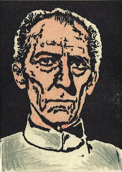
This was for the LTC tracker Star Wars.  There were just so many characters to choose from but i decided to do someone that no one picked.  I had always liked his portrayal from the films and thought of a simple design.  There was really nothing to this carve except carving out the negative space.  I probably could have done a little more detail on some of the lines and eliminated some stress lines from his forehead and chins but the likeness seemed to turn out well.  I used some colored pencils for the flesh tone and subtle color in his shirt.  The flesh tone was a little too strong so i then used an eraser over his entire face after applying it and this seemed to soften the color which then looked much better afterwards.

Monday, September 3, 2012

Famous Authors: Arthur Conan Doyle
This card was for the LTC tracker Famous Authors.  I ended chose Doyle because i was in the midst of doing a Sherlock Holmes tracker as well as having seen the tv series and movies recently.  He just stood out as someone who would be cool to do.  I originally did not carve his name on the stamp but thought it might be better if i had it on the card so proceeded to carve his moniker on a separate stamp.  It took me quite a few tries on some scraps to get that lettering right and i still had it just a 1/16 or so longer than the card stock so that also made it more difficult to line up correctly.  I stamped them both of a glossy card stock which really made the black pop.  You cannot press hard on glossy card stock or else the images will smear.  So you just have make sure you have enough inked applied and just give a firm but delicate impression when stamping.  The lines on his face and jacket could have been tighter and less jagged but i think the area around his moustache, lips and mouth came out very well.
Movies from A to Z: Quantum of Solace
This was a last second addition to my Movies from A to Z tracker.  someone had not turned their card in so i had to come up with a movie, design, and card within a few days so i could get them all out by the time the Academy Awards premiered.  This actually turned out better than i thought.  The lettering, which can be hit or miss sometimes, turned out a little choppy.  They could have been a little neater and less wobbly.  For the most part, i think Daniel Craig's face turned out fairly well.  It could have been a little cleaner and more defined but overall it was a cool card and welcome addition to the set.  I ended up using grey markers on his face, red marker to fill in the OO7 and used black pastel chalk to do the shading next to him.


Movies From A to Z: Zodiac
This tracker was my first tracker that i ever hosted.  I really wanted to do something movie themed and to coincide with the Academy Awards.  I basically sent out requests to all my favorite carvers and had them fill up the tracker.  I was going to take whatever letter was left after everyone chose theirs.  I had a feeling i would be doing one of the less popular letters so i already had in mind what movies i would be doing for certain letters.  I chose "Zodiac" because of my love for all of David Fincher's films as well as it was one of the few movies that began with "Z" that i liked.  I wanted to do a card with a movie poster look to it.  I had this idea to do a double embossing where the title of the film would be black and the Zodiac symbol would be red.  This took a little bit longer and was more challenging than i thought.  But in the end it worked out and it looked cool.  I liked how the black embossing almost disappears with the black card stock.  I then had three different images i collected to carve and assemble.  The two main characters and the golden gate bridge were all separate images i found and then pieced together to carve.  I thought it turned out pretty well.  I think Robert Downey Jr's face could have been photoshopped better and his hair got cut off a little but it's a nice card.  I added some fog with a pencil for some of the background and used a grey card stock for my foreground stamps and then pasted the whole thing onto black.

Saturday, March 3, 2012

USA Postage Stamps:
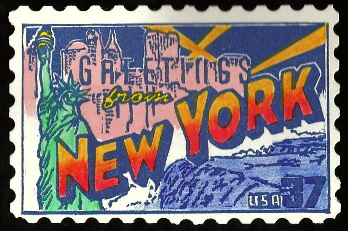
New York
This was the second card i did for the US Postage Stamps swap.  I was just trying to help fill the entire set and this was one of the last states left.  This was a bit harder for me than the South Carolina one because of the Statue of Liberty and the buildings with words intertwined with them.  I was just trying to keep everything lined up correctly with the carve because it was a one color stamp (navy blue) and some of the letters in "Greetings" were not defined as well as i would have liked them to be.  The rest of the colors i used were a combination of colored pencils, markers, and watercolor.  Again i wished i had carved it bigger than what it turned out to be.  This would have been better had it been slightly larger so i could do some of the more intricate facial features and details on the statue.  But i liked some of the lettering and the fact that it helped fill the tracker to achieve a full set.
USA Postage Stamps: South Carolina
This card was for the US Postage Stamps tracker which was a series commemorating all the states with a unique image related to each state.  The reason i chose SC was that we were traveling there late in the year and i thought it would be cool to do this up as a card and then plant it later in the state as a traditional.  This was a bit of a challenge in getting the colors right and some of the intricate details in the buildings and script letters.  I was pleased with how this turned out but probably should have measured it a little bigger because i knew i was using scalloped edges for the borders so i made the stamp smaller than it needed to be.  But i still thought it turned out fairly well even with some of the small flaws here and there.

Thursday, March 1, 2012

Wizard of Oz: Treasured Trio

This was for another Wizard of Oz tracker i signed up for.  I had been wanting to do something with the main characters for a while as well as doing another stamp to go with my previous cards.  It wasn't easy finding the right image but luckily after digging around for a while i found this one.  I really liked that the three main characters were all together and doing more of a publicity shot.  I liked some of the details on the scarecrow as well as his hand behind the tin man.  I wasn't as happy with some of the lion's fur and the tin man's face and body but it was a large stamp and the card folded out.  So i was trying something new with a foldout card.  And i also wanted to keep it black and white with a tinge of grey so i opted for a very light grey card stock.  I think the piece has that old quality to it.
Here is the front of the card i did.  I just wanted to do something of a title card like the beginning of the movie would have.  I really liked how the letters turned out.  The card folded in half and then opened horizontally to display the main characters from above.